

Good ideas from you guys, but in reality it is a waste of time. The university isn't going to change anything or listen to anyone on this site. They still never said anything about the mascot.


 Louisiana Fan
.
Louisiana Fan
.
Good ideas from you guys, but in reality it is a waste of time. The university isn't going to change anything or listen to anyone on this site. They still never said anything about the mascot.
 NCSWIC.
Ragin' Cajuns Fan for Sure
NCSWIC.
Ragin' Cajuns Fan for Sure
Its all good. I'm ready for some wide open Football in the Swamp.Originally Posted by JMV JustMyView

 Louisiana Fan
Ragin' Cajuns Fan for Sure
Louisiana Fan
Ragin' Cajuns Fan for Sure
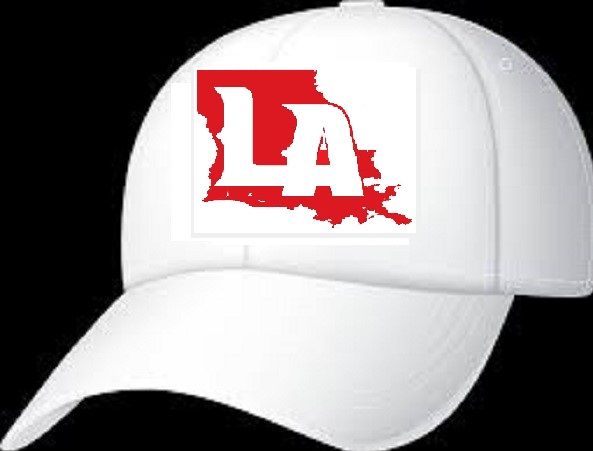
Okay I put the flames the same way and did a little editing. I really wish we would go to the LA with the state no matter how much yall disagree! That logo is clean!
Louisiana Fan
.
Damn if I’m not getting on this boat.
Louisiana Fan
Geaux Cajuns
Gross take the “A” out
Just passing through
Ragin' Cajuns Fan for Sure
tho' it tries to avert the effect by putting the little gap inside the "a," the logo ends up looking like it has deformed the state. it's hard to look at for me.
Veteran
Ragin' Cajuns #1 Fan
I like the first one for a sign or a brochure or something but it seems way too big for a hat and a little big for a helmet
Veteran
Ragin' Cajuns #1 Fan
If that is all the state has to worry about we are in good shape
 Louisiana Fan
Ragin' Cajuns #1 Fan
Louisiana Fan
Ragin' Cajuns #1 Fan
I have no problem with the state, but we are UL and should not move away from it.
Louisiana Fan
.
Tell that to T Joe
There are currently 1 users browsing this thread. (0 members and 1 guests)
 Posting Permissions

 Quote
Quote