

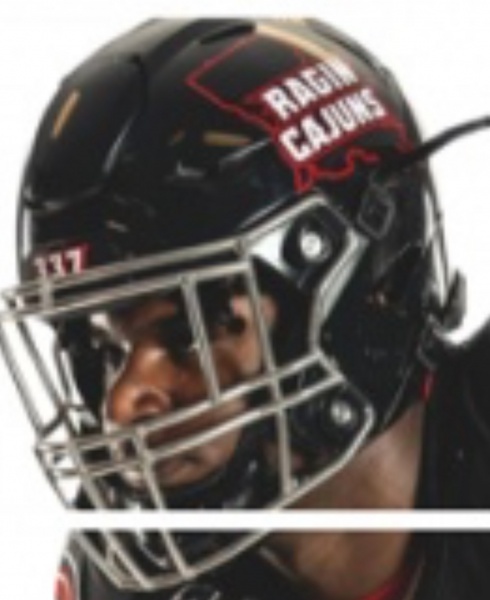
Again it would look better if it was on an actual helmet
Black version
Vs.


 Louisiana Fan
Ragin' Cajuns Fan for Sure
Louisiana Fan
Ragin' Cajuns Fan for Sure
Again it would look better if it was on an actual helmet
Black version
Vs.
Louisiana Fan
Ragin' Cajuns Fan for Sure
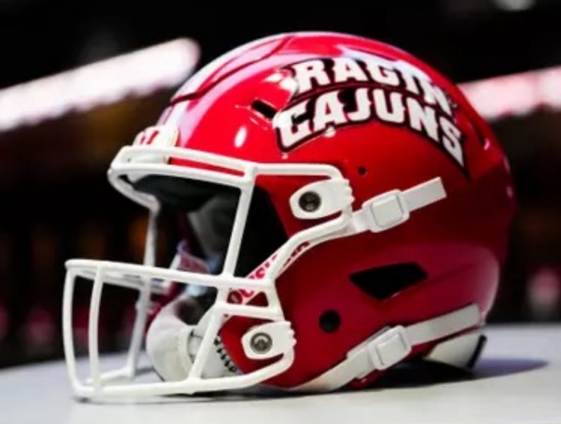
Red version again this is not an actual helmet nothing looks as good as the real thing!
Big Buds
Ragin' Cajuns #1 Fan
Rip off LaTech? They own the copyright to the State silhouette? I guess NW State and SE need to stop ripping off the Dawgs too.Originally Posted by Esqueleto

Big Buds
Ragin' Cajuns #1 Fan
I’m sure the script Cajuns will still be worn.
Veteran
Ragin' Cajuns #1 Fan
And howd they get dogs in the first place, thats pretty unique, smh
Louisiana Fan
Ragin' Cajuns Fan for Sure
I know people on here like to give ULM hell. To be honest at least the name Warhawks has significance to Monroe. Including the logos and the P-40 Warhawk logo. Which is where the name comes from. https://heartoflouisiana.com/chennaults-flying-tigers/
Even the current ULM logo it was the Century Link marketing team that came up with it. They were headquartered in Monroe. They tried to make it like the old NLU logo. Just like the P-40 face logo. It does have significance to the area.
Louisiana Fan
Ragin' Cajuns Fan for Sure
I was looking at one of the helmet threads. What about a concept from the Old USL field design with the red and white diamonds concept ? Specially in a Chrome Metallic? Its just an idea
.
Table cloth design should make Louisiana the #1 Tailgating School in the country.
There is a french element to the design as well I can't remember exactly how.
Louisiana Fan
Ragin' Cajuns Fan for Sure
If you ever go to Quebec City there are these restaurants, they are not big they have one chef and one server and 6 tables, guess they pride themselves on home cooking its different here, where we have these huge restaurants, they still have them. These white and red diamond table clothes are on every table and every restaurant that is like that.
.
Interesting
There are currently 1 users browsing this thread. (0 members and 1 guests)
 Posting Permissions

 Quote
Quote