

There’s nothing wrong with bad taste.Originally Posted by ZoomZoom


 Big Buds
Ragin' Cajuns #1 Fan
Big Buds
Ragin' Cajuns #1 Fan
There’s nothing wrong with bad taste.
Big Buds
Ragin' Cajuns #1 Fan
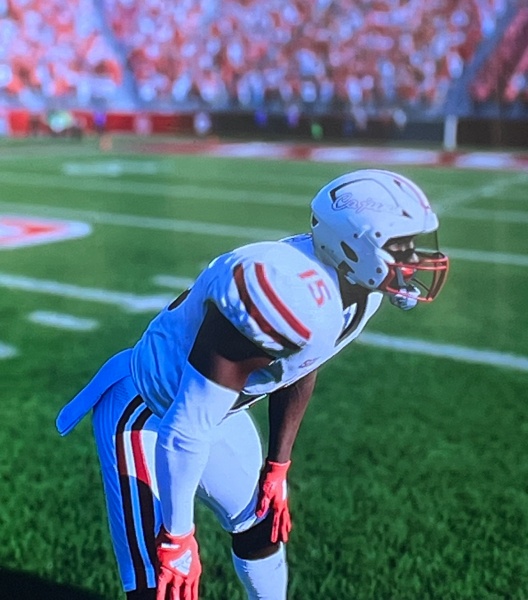
Not many helmets are recognizable from the stands. On TV it would look great.
 Louisiana Fan
Ragin' Cajuns Fan for Sure
Louisiana Fan
Ragin' Cajuns Fan for Sure
So i will do a quick comparison! Now i cant base it off realism but i will base it off the game?
Tell me whats more
recognizable? Its okay if yall dont care for it thats why i did the poll
Veteran
Ragin' Cajuns #1 Fan
Word does apear easier to see with state behind it. But state qould be easier to see without word. Why not fit word into state?
Louisiana Fan
Ragin' Cajuns Fan for Sure
The problem then comes that now the letters are to small. If to busy just take off the FDL and call it a day.
Veteran
Ragin' Cajuns #1 Fan
The baseball c and j seem different and the old one on football had an outlined thicker font and seems easier to read
Louisiana Fan
Ragin' Cajuns Fan for Sure
Well difference is the football script is red and white with thicker font the baseball script is all white.
Now I included the state because i want identifiable logo that says we are Louisiana!
Does just a script Cajuns do that? What about the stack Ragin Cajuns?
Well we got the cartoonish stacked Ragin Cajuns you definitely can see those!
Veteran
Ragin' Cajuns #1 Fan
Or make fdl bigger and no word.... i figured out whybthe j looks too thin, becuase the outline is red and is hidden by red of state.... need to switch the colors
Veteran
Ragin' Cajuns #1 Fan
Just do state outline and dont fill in state color, then letters should show thicker and more easily
Veteran
Ragin' Cajuns #1 Fan
But i prefer being ragin cajuns than just cajuns.
There are currently 1 users browsing this thread. (0 members and 1 guests)
 Posting Permissions

 Quote
Quote