

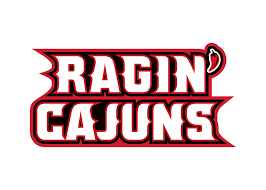
The confusing different directions logo is an "artifact" of the Hot Wheels logo.

 .
.The confusing different directions logo is an "artifact" of the Hot Wheels logo.
 Louisiana Fan
Ragin' Cajuns Fan for Sure
Louisiana Fan
Ragin' Cajuns Fan for Sure
these should be the logos we use! That way we have an alternative to each one. 2 for the nickname and 2 for the university. 2 main logos, and 2 alternatives
I can dream

.RAGIN' > right
CAJUNS < left
 Louisiana Fan
Ragin' Cajuns #1 Fan
Louisiana Fan
Ragin' Cajuns #1 Fan
ExactlyOriginally Posted by Turbine

 NCSWIC.
Ragin' Cajuns Fan for Sure
NCSWIC.
Ragin' Cajuns Fan for Sure
Although the % of arch is incorrect. You get the point.
Image is from The University of Louisiana Athletic Department HQ.
Swamp, out.
And of course reverse flow of Cajuns beneath Ragin' to match. As per T (Turbine). Completely agree baw.
Also, drop that chilli pepper thing acting as an apostrophe, that's that b.s.
I don't care what you put in its place, put something from way back in the day to reflect our 100 years+ of Louisiana athletics.
Drop that black layer. Two colors: 1. Vermillion 2. White. Example: "Vermillion and White game" for FTBL.
Louisiana Athletics Department has made Tremendous gains - This has to be pointed out. EXCELLENT work. But, this last step is the final hurdle. Complete this transition and we will never have issue again with our foundation stone.
Swamp, out. again.
Let's Geaux.
 Truly Blessed
.
Truly Blessed
.
Not to mention the two “hot wheels”.
 Ragin Cajuns
Ragin' Cajuns #1 Fan
Ragin Cajuns
Ragin' Cajuns #1 Fan
Love the "L". It does solve a lot of issues and puts us in good company with a lot of universities. To name a few prominent ones:
L - Louisiana
N - Nebraska
M - Michigan
A - Alabama
A - Arkansas
A - Arizona
F - Florida
W - Wisconsin
I - Illinois
O - Oregon
W - Washington
G - Georgia
M - Mississippi
T - Tennessee
T - Texas
 COONASS ROYALTY
Ragin' Cajuns #1 Fan
COONASS ROYALTY
Ragin' Cajuns #1 Fan
This looks like it's going backwards
Louisiana Fan
Ragin' Cajuns Fan for Sure
I assuming this is what you going for but without the pepper. Thanks Houston and Turbine for the compliments on the L.
Problem with this is just like the script Cajuns or the L it either have to be a red Ragin Cajuns on white background or white Ragin Cajuns and red background. Take out the black like this logo and it does look better!
Ragin Cajuns
Ragin' Cajuns #1 Fan
It is time for a major overhaul of our logos. It's been decades of the same old, tired looking logo. Doesn't change Louisiana Ragin Cajuns, just updates for a newer look. Here are a few suggestions to start some serious dialogue on this.
1. Use the "L" as you described. Could also center a smaller FDL on it to really distinguish us.
2. Update the Louisiana Ragin Cajuns (moniker) to a script font (see cap photo).
3. Use the Bullgator-Fideaux as our mascot (see Florida's mascots with "F").
There are currently 1 users browsing this thread. (0 members and 1 guests)
 Posting Permissions

 Quote
Quote