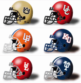
Lets face it a Logo is a trademark, a mark of recollection, a recognition anchor.
Logo's can be achieved as simply as incorporating uniquely single/multiple styled letters. Other times the fancy lettering is coupled with a symbol. And still others utilize detailed complicated designs that are instanly recognisable the second or third time they are seen.
Their singular purpose is to distinguish the wares or services of one person or organization from those of others in the marketplace. , something you can picture in your minds eye even though you may not have seen it recently. And the good ones can be recognized from the corner of your eye.
A logo is like the opening paragraph, the first impression
My criterion:
#1 instantly recognizable.
Lets face it the purpose of a good logo comes down to split second recognition and in that regard whole words lack severly. Otherwise American Telephone and Telegraph would have never made AT&T their everyday name. Even with that easy change they knew an identifiable globe logo was still a must for split second recognition.
#2 it must be doodle session capable.
When I was in the 5th grade I literally spent my free time drawing 3 things. Horses (just the bust), Indi race cars (side view), and NFL logo's.
#3 Don't just put a letter based name
It looks lame to have "gators" or "terps" or "duke" or "illinois" or "ole miss" on your helmet... it's like your school is too lazy to get a decent logo designed.
#4. Even though the Green Bay Packers "G" was my favorite helmet to draw in the late 60's I have come to realize that a single letter had no long term holding power. Those single designated letter designs like the one with a "U" by itself are as old as the hills and don't make an identity claim.


 Quote
Quote