

I like them in the way they are listed.

Ragin' Cajuns
UL
Ragin' Cajuns ( U LOUISIANA )

 Louisiana Fan
Ragin' Cajuns #1 Fan
Louisiana Fan
Ragin' Cajuns #1 Fan
I like them in the way they are listed.
Louisiana Fan
Geaux Cajuns
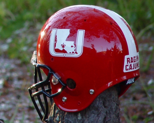
As far as the U helmet being too busy, he was talking about, you really have three elements in one in the main logo (state, fluer, U) and then on top of that you have Louisiana on the front (in an ugly font IMO) and Ragin Cajuns in the back...too much going on. As far as our nickname or mascot (because that is what the pepper is) being on the helmet taking away the prestige of the university, how about Florida, South Carolina, Arkansas, Texas, Kansas, Kansas State, Oregon State, USC, Arizona State, Michigan State, Iowa...sorry teams are so random, I just wrote them down as I thought about them. But I am all for new helmets, IF they look better than what we have, and none have. Besides I agree with the point of driving home that we are the ONLY Ragin' Cajuns in the country...why waste that bragging right?
1stTake on Louisiana
Ragin' Cajuns Rock
This may sound goofballish, but did you ever see Tom Hanks in BIG? Well I gave my nine year old the BIG in depth helmet test and she likes "THE ONE WITH THE STRIPE"
Louisiana Fan
Geaux Cajuns
Don't underestimate the opinions of kids, they have a tendency not to over analyze too much. But I would like to see if the opinion changed if all three were graphic replicas, rather than an actual photo and two replicas.
Louisiana Fan
Geaux Cajuns
But that might be me just over analyzing...

 WE ARE LOUISIANA
Ragin' Cajuns Fan for Sure
WE ARE LOUISIANA
Ragin' Cajuns Fan for Sure
I e-mailed the two you had yesterday to Rickey Bustle. My feeling is that people are familiar with "Ragin' Cajuns." "Louisiana" association with Ragin' Cajuns is the gap we must bridge. Your helmet and the tri-fleur helmet both accomplish that. The other candidates you have listed have one without the other. If that is an actual helmet you might want to consider taking it to Bustle and letting him see it.
Great job. You're good at putting your ideas down into something people can look at.
 Louisiana Fan
Ragin' Cajuns Fan for Sure
Louisiana Fan
Ragin' Cajuns Fan for Sure
I think the helmet with the Louisiana on it is the best option, because 1.) It has Ragin Cajuns on it, and 2.)it's a very eye-pleasing catchy way to show UL (with the Miami style U, and the State of Louisiana with the fleur-de-lis where Lafayette is), and 3.) speaking of the fleur-de-lis, it's a great way to show where Lafayette is, without necessarily having to incorporate it into our name, and 4.) I think we should maybe have Ragin Cajuns somewhere's on the jerseys.
God Bless.
 Ragin Cajuns of Louisiana
The existing helmet design is great since it's prominent display of RAGIN CAJUNS does more to identify us than any other logo could possibly do. We don"t want to make our thrust as having our helmets only look good to us, the loyal following, but to be more recognizable to those who do not realize who we are. For that reason the RAGIN CAJUN inscription is perfect. Trying to invent a new helmet logo when we are already working hard to promote this very successful one, is an effort which could confuse those we are trying to reach.
Please keep what we've got. It is working very well all over the nation. Let's get behind Our current helmet logo and promote it as much as we can.
GO RAGIN CAJUNS
K
K
WE ARE LOUISIANA
Ragin' Cajuns Fan for Sure
My concern is that Ragin' Cajuns be associated with LOUISIANA and MAJOR college. I think there is some danger of being pigeonholed as small time if we don't establish that University of Louisiana association. Louisiana-Lafayette is too much like Wisconsin-Green Bay.
Permanent identification begins with an uncomplicated picture image. Then you WIN under that image. Then people remember you.
I think the administration is making a mistake not getting the Louisiana in there somehow, even in an abstract sense. Especially so now that Monroe does!
Louisiana Fan
Geaux Cajuns
well if that is the case, can you tell me what is on the side of Northern Illinois' helmet? They have turned into a good program, it must be because of the helmet right?
There are currently 1 users browsing this thread. (0 members and 1 guests)
 Posting Permissions

 Quote
Quote