

I did all three with my vinyl sign business equipment, but I only designed the last one

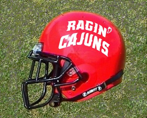
Ragin' Cajuns
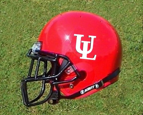
UL
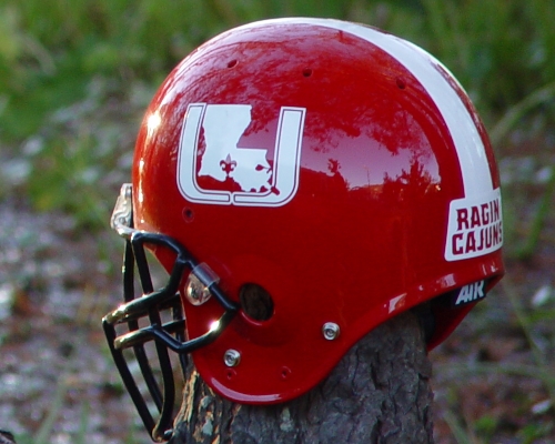
Ragin' Cajuns ( U LOUISIANA )
 .
.
I did all three with my vinyl sign business equipment, but I only designed the last one
 Louisiana Fan
Ragin' Cajuns Greatest Fan Ever
Louisiana Fan
Ragin' Cajuns Greatest Fan Ever
Ragin Cajuns, the coolest name in college athletics today.
case closed.
Z.
.
I am wth you Z. A University of Louisiana helmet without Ragin' Cajuns would not be worth its salt.Originally posted by Zeebart21
Ragin Cajuns, the coolest name in college athletics today.
case closed.
Ragin Cajuns of Louisiana
Go Cajuns
I agree
2000 Alumni
Ragin' Cajuns Fan for Sure
My thoughts exactly, our current design (i.e. name) is the most unique name in college athletics! DO NOT CHANGE IT!!!!
RP Support Team
Go Cajuns
I count two helmets that have Ragin' Cajuns visible. Could you all be a little more specific? Thanks
Louisiana Fan
Geaux Cajuns
The one that you would actually be able to see Ragin' Cajuns...on the side. I talked with the Graphics designer who takes care of all of our logos here, and I showed him the U helmet. First words out of his mouth were, "too busy, too much going on." I tend to agree with him. And I agree with others who say our current helmet is our best, until somebody comes up with something better. Our Designer looked at all of our apparel on lids.com and the bookstore's website, and he suggested a couple of things. 1) using the pepper on the side of the helmet. 2) Using a "classic" form of the fluer de lis 3) Use a flaming RC (for Ragin Cajuns). I didn't really like the third option. But just wanted to let y'all know.

 lsu delenda est
Ragin' Cajuns #1 Fan
lsu delenda est
Ragin' Cajuns #1 Fan
Right Now, the current helmets serve our purpose just fine. However, in the future, a more "stately" helmet logo will be required. To be known as THE UNIVERSITY of LOUISIANA and have our nickname(or a pepper) on the helmet could be seen as a little cheesy.
At that point, option #2 is the only real option. The much hated tri-fleur fits all requirements for a helmet logo for THE UL.
We better get used to it.
Louisiana Fan
Geaux Cajuns
we don't need three, one would be suffice.
Louisiana Fan
Ragin' Cajuns Rock
Hello, I am gridiron long time reader first time poster. Im not voting because I like all three. All three helmets look good in different ways and for different reasons. Normally I have a disdain for words and letters on helmets, but Ragin' Cajuns is as catchy a term as any in sports. It gets a free pass, and free pass or not the large words are overcrowding the helmet, I would tweak it by shrinking Ragin' Cajuns fifteen percent. The Interlocking UL is my least favorite if for no other reason because it needs explaining, but I still like it a lot. U-Louisiana is my favorite I don't see it as busy. It would be hard to grasp busy, I have no problem seeing University of Louisiana it is as plain as day. I dont like stripes so I would take the stripe and Ragin' Cajuns off the helmet and add a RAGIN' CAJUN patch to each arm. Its not like the helmet is ever worn without the uniform.
There are currently 1 users browsing this thread. (0 members and 1 guests)
 Posting Permissions

 Quote
Quote