

Vintage Evolution
Indiana University
Louisville Design

 .
.
Vintage Evolution
Indiana University
Louisville Design
 Louisiana Fan
Ragin' Cajuns Fan for Sure
Louisiana Fan
Ragin' Cajuns Fan for Sure
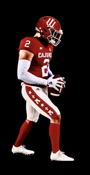
I like it lets stick with it!! What you think of this uniform? To me its going in teambuilder on my Ragin Cajuns build for CFB: 26Originally Posted by Turbine

.
Impressed
Louisiana Fan
Go Cajuns
The third one looks like it has droopy drawers.
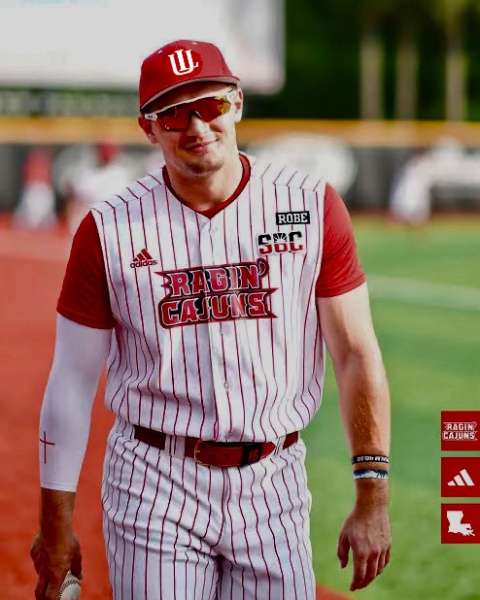
.Side by side

 Louisiana Fan
Ragin' Cajuns Fan for Sure
Louisiana Fan
Ragin' Cajuns Fan for Sure
Their I does not look like it is behind the U but our L always looks behind the U. Need it in front or even, the patch on the other page was better for that aspect
.
The L should always behind the U in UL.
They are Indiana University the I is in front of U in IU.
UL is semetrical.
For IU to accomplish the visual feel of the I being in front of U they had to make it 40% larger than the U.
That is why the I is both above and below the U.
Louisiana Fan
Go Cajuns
First is the best one
Louisiana Fan
Ragin' Cajuns Fan for Sure
I got yall. I mess with it made minor details, First i widen the letters to make it stand out more
Louisiana Fan
Ragin' Cajuns Fan for Sure
I am talkimg about the lines where they cross
There are currently 1 users browsing this thread. (0 members and 1 guests)
 Posting Permissions


 Quote
Quote