

Unfortunately, I think you are correct.....Originally Posted by JamesTheJeweler


 UL Ragin Cajuns
Ragin' Cajuns Fan for Sure
UL Ragin Cajuns
Ragin' Cajuns Fan for Sure
Unfortunately, I think you are correct.....
 Ragin Cajuns
Ragin' Cajuns #1 Fan
Ragin Cajuns
Ragin' Cajuns #1 Fan
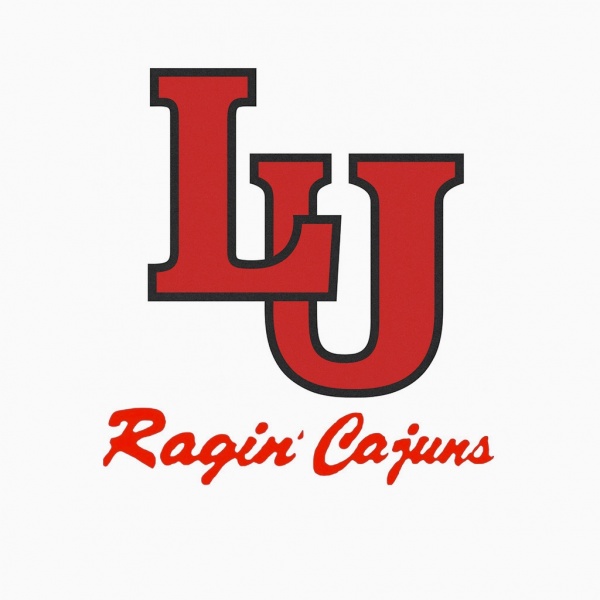
Try interposing the L over the U like IU does or CU or OU or KU.
 Louisiana Fan
Ragin' Cajuns Fan for Sure
Louisiana Fan
Ragin' Cajuns Fan for Sure
I dont want to take away from Turbine because he totally came
Up with that idea, but this is what i have done, now it will be 3 i used block letters to make it look more old school. Like IU, or BU.
Or it could be a little off
centered with a bigger L?
Since i got the creative juices flowing, keeping with out style!
Louisiana Fan
Ragin' Cajuns Fan for Sure
Turbine when you get a chance post your LU logo the one that i interactive you got a picture of it?
.
The one at the beginning and end of the "Raise Your Hands" video?
Louisiana Fan
Ragin' Cajuns Fan for Sure
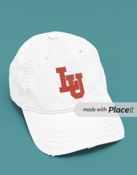
Okay this took more time then i thought but this looks great!!
Louisiana Fan
Ragin' Cajuns Fan for Sure
Sorry got lost in all attachments but to me this is the best with no trim! &hit is beautiful
 Louisiana Fan
Ragin' Cajuns #1 Fan
Louisiana Fan
Ragin' Cajuns #1 Fan
Well were gonna be in the same conference as Lamar sooner or later so we might as well have the same logo as them too
Louisiana Fan
Ragin' Cajuns Fan for Sure
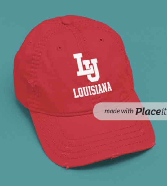
This is it Turbines UL, LU it doesnt matter !! With my stripe is a win!
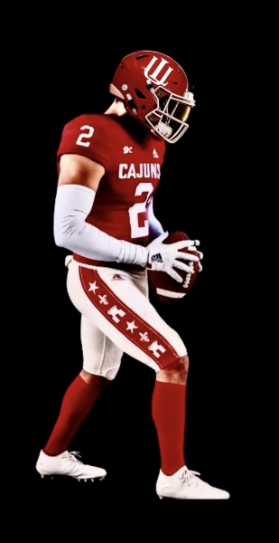
That needs to be the alternate uniforms for next year!!

Louisiana Fan
Ragin' Cajuns Fan for Sure
I am feeling very satisfied with this!! Yall can not tell me that yall dont love it. To me that is it. I dont think its getting much better then this!
Thankyou HoustonCajun for the idea, and Turbine for the logo, i am taking credit for the stripe though ! ROFL!
There are currently 1 users browsing this thread. (0 members and 1 guests)
 Posting Permissions

 Quote
Quote