Winning makes everything look better.
Winning exciting games make things look great!
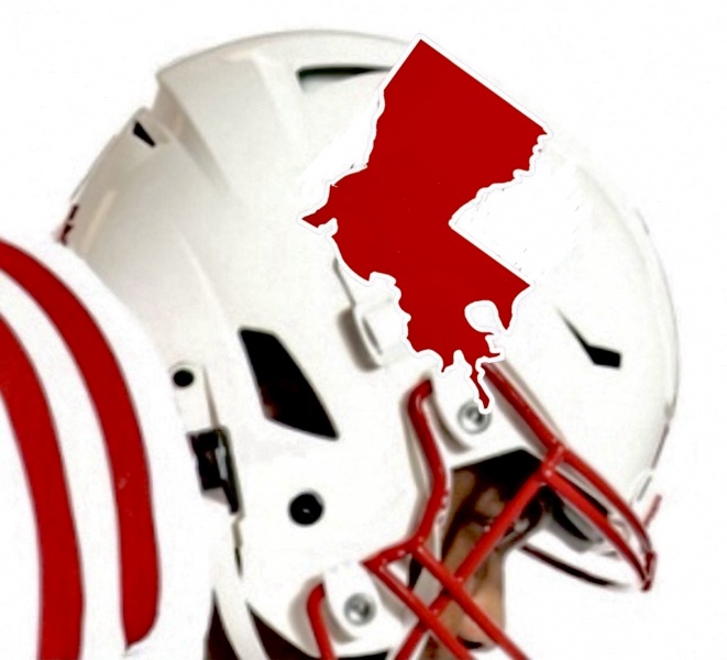
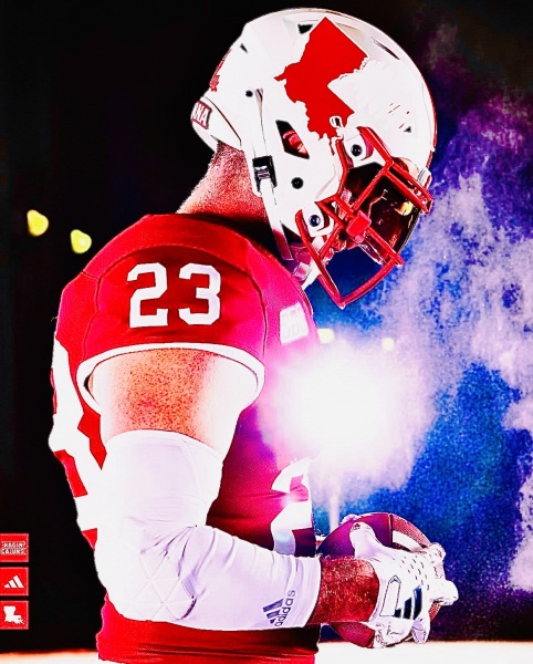
Wasnt sure if i was going to even post this. Think the white with just the red state would make great alternate white uniforms.

I mean it would make some good Merch!!
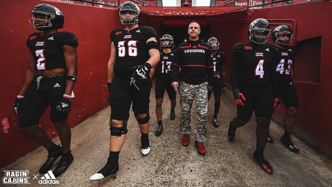
With these jerseys with Louisiana on the front.

Now that looks like Thee University of Louisiana Ragin Cajuns!

This is the best picture i have found to do this with. Do a quick comparison with the state silhouette.

. . . No matter what anyone else says, the silhouette of the State of Louisiana just SCREAMS Louisiana . . . say it loud and clear LOUISIANA . . .
Hear me out: a red Louisiana on a white helmet with white letters inside the Louisiana: R1.
There are currently 1 users browsing this thread. (0 members and 1 guests)