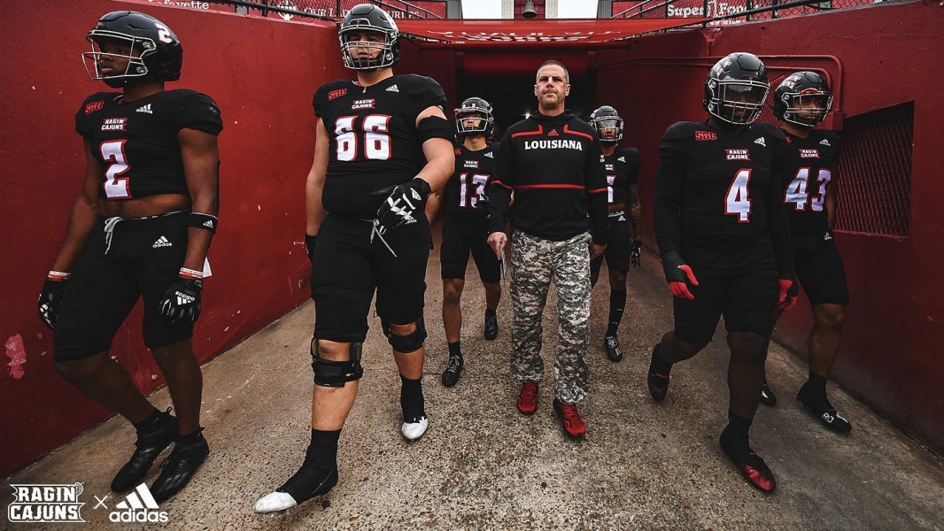
Any color uniform that makes red look bad should be a no no. Any color uniform that makes official school colors look bad should be persona non gra ta.
Any color uniform that makes red look bad should be a no no. Any color uniform that makes official school colors look bad should be persona non gra ta.
The best look we’ve ever had in black to me was the 1st New Orleans Bowl. Black helmet. Black pants. Red top. Even though those tiny fleur de lis on the sleeves were awful. That combination with our standard helmets/jersey designs from now I wouldn’t mind.
Winning makes everything look better.
Winning exciting games make things look great!
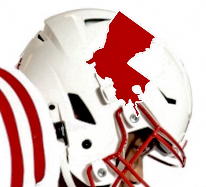
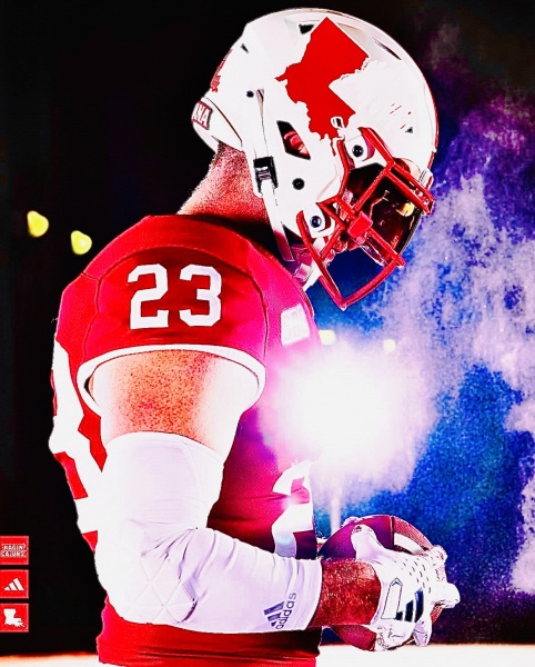
Wasnt sure if i was going to even post this. Think the white with just the red state would make great alternate white uniforms.

I mean it would make some good Merch!!
With these jerseys with Louisiana on the front.

Now that looks like Thee University of Louisiana Ragin Cajuns!

This is the best picture i have found to do this with. Do a quick comparison with the state silhouette.

There are currently 23 users browsing this thread. (2 members and 21 guests)