Poll: Which Helmet Looks Better?

Page 2 of 7 FirstFirst 1 2 3 4 5 ... LastLast
Results 13 to 24 of 84

Thread: Which Helmet Looks Better?

  1. Default Re: Which Helmet Looks Better?

    I bet black helmets with a flake red Louisiana across the helmet could be the sharpest helmet we ever wear . . . custom makes black beautiful and here to stay . . .


  2. #14

    Default Re: Which Helmet Looks Better?

    Quote Originally Posted by Ragin9221 View Post
    How so? Indiana does it Ohio does it etc.
    Indiana who?

    Biggest problem with this university is lack of consistency when it comes to banding. We have been changing various things year to year. Week to week. Now we are back to trying to promote USL.

    We all know we want people to call us Louisiana. How many different ways to we have to try and make that stick? Is Louisiana on the front of our jersey not enough?

  3. #15

    Default Re: Which Helmet Looks Better?

    Quote Originally Posted by RaisingCajun08 View Post
    Indiana who?

    Biggest problem with this university is lack of consistency when it comes to banding. We have been changing various things year to year. Week to week. Now we are back to trying to promote USL.

    We all know we want people to call us Louisiana. How many different ways to we have to try and make that stick? Is Louisiana on the front of our jersey not enough?
    No one is trying to get rid of our current football uniforms. I am proposing these as alternates like for instance the all white we wore at TxSt or the All black we gonna wear for South Alabama.

    If you gonna put Cajuns on the front of the jersey then why not put Louisiana on the helmet?

    We should be able to brand Louisiana in multiple way in multiple fonts. I an gonna use Indiana as an example. They use two different fonts on the same uniforms.
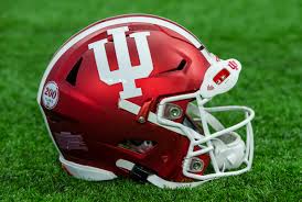
    Name:  IMG_0452.jpeg
Views: 193
Size:  210.9 KB

    Name:  IMG_0453.jpg
Views: 184
Size:  61.0 KB

    Name:  IMG_0455.jpg
Views: 188
Size:  125.0 KB

    Name:  IMG_0454.jpeg
Views: 187
Size:  33.8 KB

  4. #16

    Default Re: Which Helmet Looks Better?

    The main uniform is the IU helmet with Indiana on the front


  5. #17

    Default Re: Which Helmet Looks Better?

    Script Cajuns helmet, Louisiana on the front of the jersey. This is not hard.


  6. #18

    Default Re: Which Helmet Looks Better?

    Quote Originally Posted by CharlieK View Post
    Script Cajuns helmet, Louisiana on the front of the jersey. This is not hard.
    Okay so for these black jerseys? You rather brand ourselves Ragin Cajuns, Cajuns?

    Why not if you gonna put Cajuns on the jersey why not put Louisiana on the helmet?

    We have no problem with Cajuns we have no problem with people knowing we are the Ragin Cajuns. Our problem comes in is that we can not brand Louisiana properly!!!

    Indiana doesnt even have Hoosiers on there uniform they do have some alternates with Hoosiers, but everyone knows they are the Hoosiers. So why brand that. We need to brand Louisiana!

  7. #19

    Default Re: Which Helmet Looks Better?

    Quote Originally Posted by Ragin9221 View Post
    Okay so for these black jerseys? You rather brand ourselves Ragin Cajuns, Cajuns?

    Why not if you gonna put Cajuns on the jersey why not put Louisiana on the helmet?

    We have no problem with Cajuns we have no problem with people knowing we are the Ragin Cajuns. Our problem comes in is that we can not brand Louisiana properly!!!

    Indiana doesnt even have Hoosiers on there uniform they do have some alternates with Hoosiers, but everyone knows they are the Hoosiers. So why brand that. We need to brand Louisiana!
    We have been trying to brand Louisiana. My point is changing constantly does not help with branding. It adds to confusion.

    I'm 100% with Charlie on this one. Its not that hard. Louisiana on jersey. Cajuns, Ragin Cajuns, Fleur de Lis on helmet. You pick. Just stick with what you pick. No need to have 15 different uniform combinations.

  8. #20

    Default Re: Which Helmet Looks Better?

    Quote Originally Posted by RaisingCajun08 View Post
    We have been trying to brand Louisiana. My point is changing constantly does not help with branding. It adds to confusion.

    I'm 100% with Charlie on this one. Its not that hard. Louisiana on jersey. Cajuns, Ragin Cajuns, Fleur de Lis on helmet. You pick. Just stick with what you pick. No need to have 15 different uniform combinations.
    Okay respect no alternates. One uniform thats it. We agree to disagree.

  9. #21

    Default Re: Which Helmet Looks Better?

    Quote Originally Posted by Ragin9221 View Post
    Okay so for these black jerseys? You rather brand ourselves Ragin Cajuns, Cajuns?

    Why not if you gonna put Cajuns on the jersey why not put Louisiana on the helmet?

    We have no problem with Cajuns we have no problem with people knowing we are the Ragin Cajuns. Our problem comes in is that we can not brand Louisiana properly!!!

    Indiana doesnt even have Hoosiers on there uniform they do have some alternates with Hoosiers, but everyone knows they are the Hoosiers. So why brand that. We need to brand Louisiana!
    Variations of red red, white white, red white. I just think the black thing is played out.

    Basically the uniforms we wore Saturday with Louisiana on the jersey, and higher quality number placement (something looked off about those).

  10. #22

    Default Re: Which Helmet Looks Better?

    Quote Originally Posted by Ragin9221 View Post
    Okay respect no alternates. One uniform thats it. We agree to disagree.
    I'm okay with 1 alternative. But it should be very similar to the "traditional" standard. I love the NFL color wave and MLB City Connect options. Go all black with red oversized Fleur de Lis on helmet. Same Louisiana on the front of the jersey. Same number style.

  11. #23

    Default Re: Which Helmet Looks Better?

    Ragin, try integrating the face mask with your state outline on the red one


  12. #24

    Default Re: Which Helmet Looks Better?

    Quote Originally Posted by Swamp View Post
    Ragin, try integrating the face mask with your state outline on the red one
    Like how?

    I took out thr black border put it closer to the facemask?

    Name:  6E55AF30-09A4-49ED-9301-34757ADF6658.jpg
Views: 80
Size:  196.5 KB

Page 2 of 7 FirstFirst 1 2 3 4 5 ... LastLast

Thread Information

Users Browsing this Thread

There are currently 2 users browsing this thread. (0 members and 2 guests)

Similar Threads

  1. Louisiana Script Helmet?!
    By Ragin9221 in forum RagePage
    Replies: 23
    Last Post: November 11th, 2024, 09:32 am
  2. Which Helmet looks Better?
    By Ragin9221 in forum RagePage
    Replies: 52
    Last Post: July 29th, 2024, 07:36 pm
  3. Concept Helmet?
    By Ragin9221 in forum RagePage
    Replies: 43
    Last Post: September 17th, 2023, 06:50 pm

Posting Permissions

  • You may not post new threads
  • You may not post replies
  • You may not post attachments
  • You may not edit your posts
  •