

 Louisiana Fan
Ragin' Cajuns Fan for Sure
Louisiana Fan
Ragin' Cajuns Fan for Sure
Louisiana Fan
Ragin' Cajuns Fan for Sure
Louisiana Fan
Ragin' Cajuns Fan for Sure
Surprise there!? Lol seriously but i think if you took out the interlocking L’s i think it would look better, i mean it still within the guidelines of the rule.Originally Posted by Turbine

Louisiana Fan
Ragin' Cajuns Fan for Sure
To me this looks like a legit logo!! This to me looks so old school!!

Louisiana Fan
Ragin' Cajuns Fan for Sure
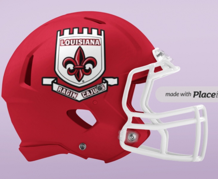
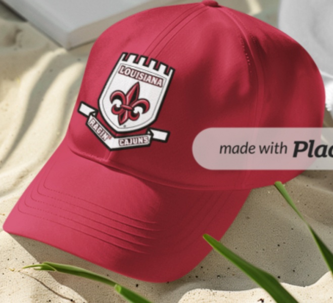
I wanna here yall opinion on this one! I love this because it’s different, looks academic, it is old school, and I this also incorporate parts or the spanish influence, that goes with the FDL with Louisiana and Ragin Cajuns and this area.
Also it can better gotta make the Ragin Cajuns symmetrical

 Louisiana Fan
Ragin' Cajuns #1 Fan
Louisiana Fan
Ragin' Cajuns #1 Fan
Is it gameday yet? Sheesh
Louisiana Fan
Ragin' Cajuns Fan for Sure
Think it looks good i improved on it. Really trying to make an effort in improving our logo situation.
Louisiana Fan
Ragin' Cajuns #1 Fan
That’s a soccer logo. Not a football helmet logo. I get and appreciate your passion but all of this is for naught. And the majority of your threads turn into a logo takeover. It’s never gonna happen.
.A Crest logo should be in the array.
In the first rendition Ragin Cajuns is too close. In the subsequent rendition Ragin' Cajuns is to far apart.
If the apostrophe were in the crease maybe?
Louisiana Fan
Ragin' Cajuns Fan for Sure
This is for the people who oppose using the state because its a Louisiana Tech thing.
 Truly Blessed
.
Truly Blessed
.
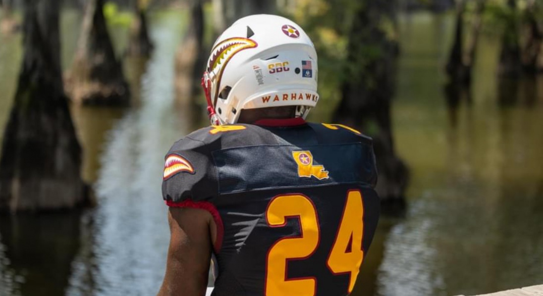
ULM folks hate this uniform. Looks too much like Grambling
There are currently 1 users browsing this thread. (0 members and 1 guests)
 Posting Permissions


 Quote
Quote