LOUISIANA Ragin Cajuns ... or something similar with both words?
Thanks
LOUISIANA Ragin Cajuns ... or something similar with both words?
Thanks
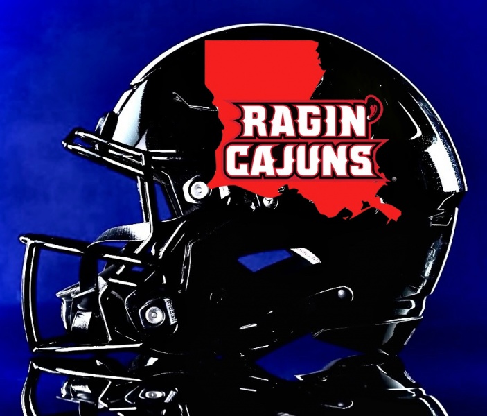
I am gonna try something else, but this with the picture this is how it comes. I am no expert but feel like if the background is white then the state needs to red etc.

No bueno on the helmet, I like the logo, but not on a football helmet, too hard to see.
First off, we have Louisiana across our chest, so we absolutely do not need to copy LaTurd and put it on a helmet.
Our uniforms from last season were just about perfect. We did not need to change anything.
I know what the University is doing, and this is just me adding the logo to the helmet, but if you gonna do it the background and the state have to be two different colors to me!

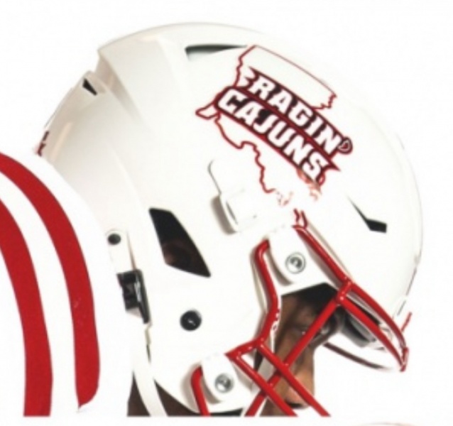
I actually like the white and the black helmets with that logo, specially the
white. I am not really down with the red state behind the black background. Do i think it as good as the FDL with state no, but i believe it is doable as long as the color of the helmet is not the same color as the state.
I put a black border around the red state on this one to give it more definition
Its me adding photos to another photo so its not the same as a real helmet.
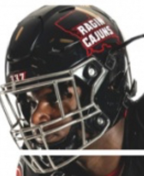
As opposed to this?

Made the logo little smaller. Like all i see is ragin cajuns cant really tell there is the outline of the state on theirs
Black version like you cant even see the state on there version

If you write louisiana higher then you only have to make it a little smaller to fit entirely in state
There are currently 3 users browsing this thread. (0 members and 3 guests)