This is it man that look Beautiful, thats what they need to adopt!!! Wow!! Yall cant tell me yall dont like that !
Not to busy. Man i like that !!
I would wear that hat !!
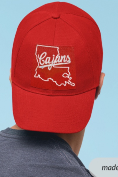
This is it man that look Beautiful, thats what they need to adopt!!! Wow!! Yall cant tell me yall dont like that !
Not to busy. Man i like that !!
I would wear that hat !!

Added a FDL. Colored in the Cajuns to take out the spots. I think this looks legit!
Cajun stands out better without the spots.
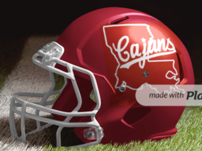
perfect, with Louisiana across the chest! always. PERFECT!
Code cracker.
I darken it up

Million$Mullet not bad!! Also digging the all red.
Also here you go Turbine.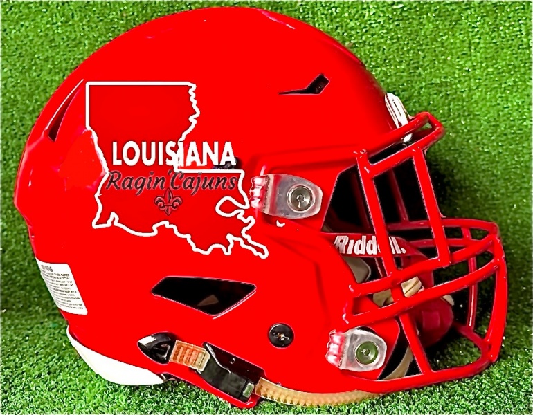
Sorry, not a fan of state outline. Too much like tech.
Agreed! We need a symbol that says that. My main goal is not create a logo, but a logo that says we are the University of Louisiana without saying it.
We have gotten away from UL and I get it, but having Ragin Cajuns logo on everything does not establish us as Louisiana.
I want a symbol that tells the world what the name of the school is! Thats not UL-Laf, ULL, UL-Lafayette etc
Thats why i harp on the state and FDL.i think it does exactly that. Trying to think outside the box besides the state or a letter?
I am fine going this route
There are currently 1 users browsing this thread. (0 members and 1 guests)