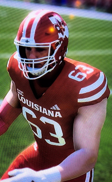
Yall cant tell me that logo wouldnt work? Think it would be a game changer in being known as Louisiana!

Yall cant tell me that logo wouldnt work? Think it would be a game changer in being known as Louisiana!

Now imagine these in real life!?

We may not play in the SEC, but we can sure look like we do.
All white uniforms!
All black uniforms!

Let's say that they choose to go with this for the helmet. Do you think that this is all they would do? Do you think they are just gonna remove Ragin Cajuns form the uniform completely?
I guarantee you that they would replace the LOUISIANA across our chests with Ragin Cajuns.
I am not willing to destroy our branding like that.
We should never (Ever) stop using LOUISIANA across the chest in football. It's the best advertisement .You think TEXAS is thinking about not having TEXAS on their football uniform! absolutely not! It is sad how baseball has did away with their Louisiana uniforms for the past year. WHY?
LOUISIANA 1st
Its good for branding.
No one is willing to destroy Ragin Cajuns brand, just like these helmets they came out with, it would be an alternative uniform. Like for white out games etc., just like these helmets
This would only replace the UL logo, no one is saying or i am not saying going off the reservation and getting rid of Ragin Cajuns completely not even close.
This only replaces the interlocking UL logo.
It definitely feels like there is an intentional want to get rid of the Louisiana on uniforms and put script Cajuns on everything. Why can't we have both. Almost feels like upper administration in Martin hall is pushing this, after so many years of fighting for The name Louisiana! I personally think there is pressure from inside this State to take it off uniforms! And our Admin don't have the will to fight for it anymore!
There are currently 1 users browsing this thread. (0 members and 1 guests)