

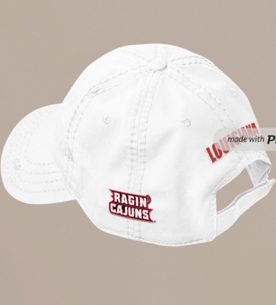
How about something like this? Incorporated all three logosOriginally Posted by HoustonCajun


 Louisiana Fan
Ragin' Cajuns Fan for Sure
Louisiana Fan
Ragin' Cajuns Fan for Sure
How about something like this? Incorporated all three logos
Louisiana Fan
Ragin' Cajuns Fan for Sure
Or this?
 .
.
I like
Louisiana Fan
Ragin' Cajuns Fan for Sure
Thanks!!
Louisiana Fan
Ragin' Cajuns Fan for Sure
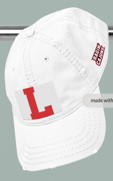
Here is a quick comparison the interlocking UL was great, but if we are not going to use it then the L!

 Ragin Cajuns
Ragin' Cajuns #1 Fan
Ragin Cajuns
Ragin' Cajuns #1 Fan
Just curious. What would Ragin Cajuns look like in the Cajuns font? The old Ragin Cajuns logo is just that, old and worn. JMO.
Ragin Cajuns
Ragin' Cajuns #1 Fan
Nice!
Louisiana Fan
Ragin' Cajuns Fan for Sure
May the best hat win!!
Red First
Then White
Louisiana Fan
Ragin' Cajuns Fan for Sure
Tempted to do a poll!

Wow
.
The state hats scream Louisiana. They don’t scream Louisiana Tech, Northwestern or LSU. They scream LOUISIANA.
Louisiana Fan
Ragin' Cajuns Fan for Sure
Then if the state looks good do we want a bigger state or bigger FDL? Personally like these better but i dont want to over hype one type.

Wow
.
Yes
Louisiana Fan
Ragin' Cajuns Fan for Sure
I love the the state outline logo, either one is fine.
My only thing is if the University adopts any of these logos i just feel like the L would be more accepted by the general public.
Louisiana Fan
Ragin' Cajuns Rock
Love the state logo!!
 Louisiana Fan
Ragin' Cajuns #1 Fan
Louisiana Fan
Ragin' Cajuns #1 Fan
On the white hat, I think the state outlined in bold red but with no fill with the large FDL might look good. Wouldn't work with the red though.
There are currently 1 users browsing this thread. (0 members and 1 guests)
 Posting Permissions

 Quote
Quote