State logo hats are very nice, preferably with the bigger FDL


 Louisiana Fan
Ragin' Cajuns #1 Fan
Louisiana Fan
Ragin' Cajuns #1 Fan
State logo hats are very nice, preferably with the bigger FDL
Louisiana Fan
Ragin' Cajuns #1 Fan
Have you looked at the Ebbets Field Flannels vintage hats? A lot of them are similar block letter or single letter hats. Some really nice ones. I think simple things like a slightly unique font really make the single letter logo unique. What I had noted in my post a while back was that it may be generic and not a huge fan when it's like that, but that's not to say a single L couldn't work. I think there's some ways to tweak and make it look really unique.Originally Posted by Ragin9221

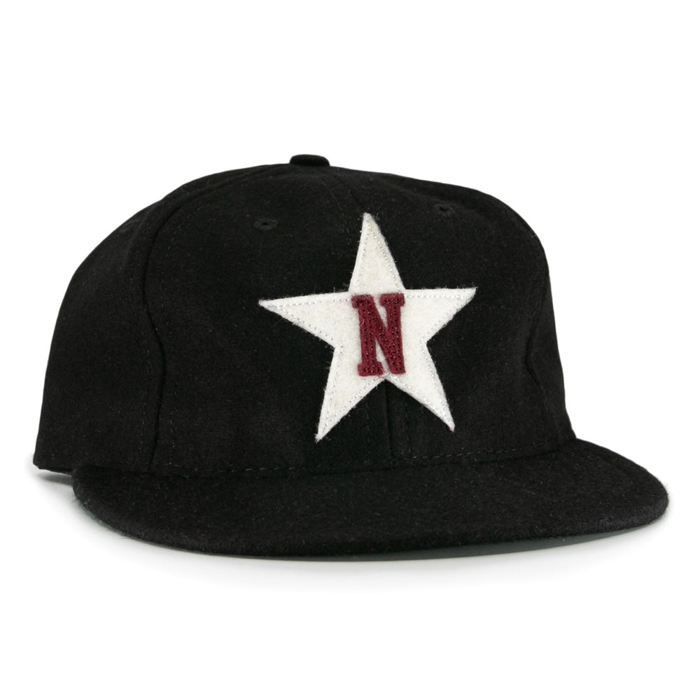
I wonder if something similar with the FDL outline and plain color fill instead of the star with an L in here:
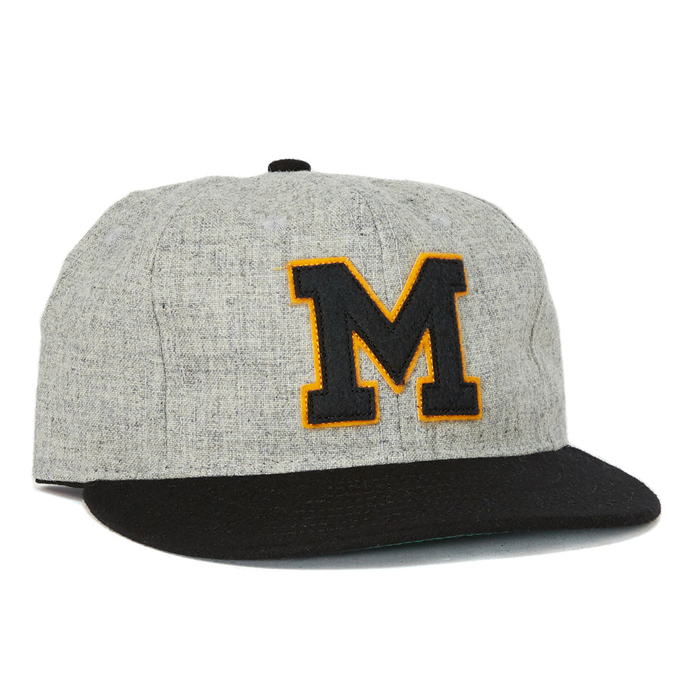
Standout logo for Mizzou that's easily identifiable:
I know a lot dont like our athletics font (past or more recent) but those are L's that we could pull from if we're trying to connect to a historical logo:
Past on Russell unis
Current on Adidas
60s-80s style font
60s-80s block style
I think the last block L may be one of the better looking and unique L's that could be used
 Louisiana Fan
Ragin' Cajuns Fan for Sure
Louisiana Fan
Ragin' Cajuns Fan for Sure
Thankyou for the suggestion!! Looks great! This is a great look! That logo could be used for both red and white!
Louisiana Fan
Ragin' Cajuns Fan for Sure
Yeah these look stand out more then the FDL

ads may earn compensation
.Geaux Cajuns
Veteran
Ragin' Cajuns #1 Fan
Ugly....
Veteran
Ragin' Cajuns #1 Fan
Saw a st george medical school add on here, is that the new town near the mall of louisiana?
.
It shows ads based on the sites you visit most.
Louisiana Fan
Ragin' Cajuns Fan for Sure
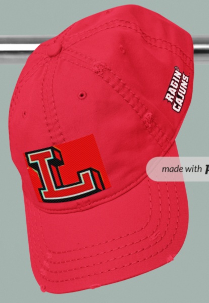
That is the problem with UL hats! They are hideous, The only good one is with the FDL, and the one that has Louisiana. That is it.
We have to do better.
https://louisiana.spirit.bncollege.com/d-8008
Veteran
Ragin' Cajuns #1 Fan
Wasnt complaining about the add, just curious the location
There are currently 1 users browsing this thread. (0 members and 1 guests)
 Posting Permissions

 Quote
Quote