

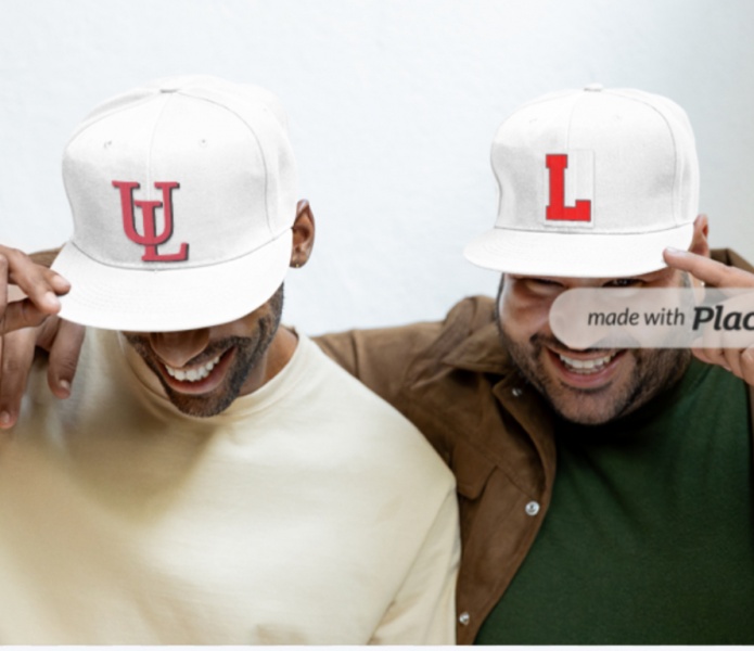
It was Louisville who first used and then abandoned the interlocking UL.Originally Posted by Ragin9221


 .
.
It was Louisville who first used and then abandoned the interlocking UL.
 Louisiana Fan
Ragin' Cajuns Fan for Sure
Louisiana Fan
Ragin' Cajuns Fan for Sure
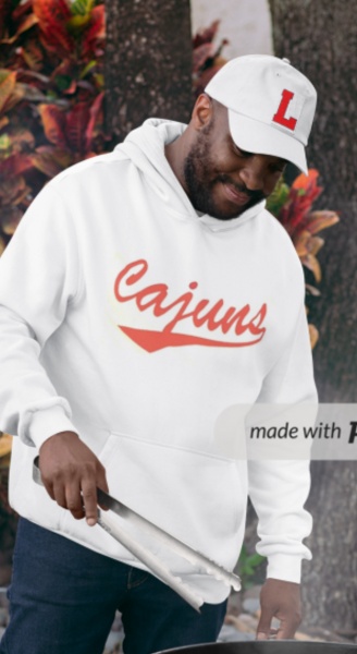
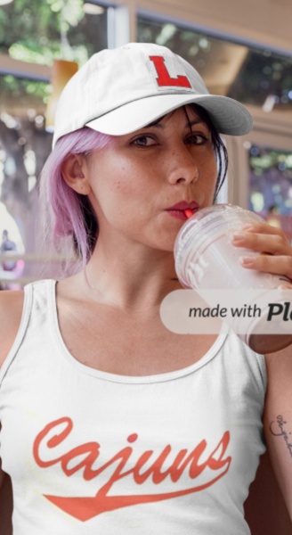
I created a white version of the block L. Which i thought of when the softball team was wearing there white uniforms. A red L would look great with a white back ground
 Louisiana Fan
Ragin' Cajuns #1 Fan
Louisiana Fan
Ragin' Cajuns #1 Fan
I love it. Think I'm gonna create my own just like it
Louisiana Fan
Ragin' Cajuns Fan for Sure
Yeah smart move !!!
 Ragin Cajuns
Ragin' Cajuns #1 Fan
Ragin Cajuns
Ragin' Cajuns #1 Fan
That combination is awesome. That block L, red with black trim on a white cap and white with black trim on a red cap, looks best and is the way to go. I would add that same Cajuns logo on the back of the cap so there is no mistaking who we are. I am glad to see we are updating the old Ragin Cajuns logo with the new Cajuns logo. This is far superior.
Lastly, regarding LSU's use of the L, that will not stand. Louisiana State is entrenched as LSU. Using an L will not be their identity any more than Florida State using an F like Florida or Michigan State using an M like Michigan. LSU already has its brand, LSU. We need our brand, L, and be proudly among all the P5 schools who do the same thing. We need to do it NOW.
Louisiana Fan
Ragin' Cajuns Fan for Sure
How about something like this? Incorporated all three logos
Louisiana Fan
Ragin' Cajuns Fan for Sure
Or this?

.
I like
Louisiana Fan
Ragin' Cajuns Fan for Sure
Thanks!!
Louisiana Fan
Ragin' Cajuns Fan for Sure
Here is a quick comparison the interlocking UL was great, but if we are not going to use it then the L!
There are currently 1 users browsing this thread. (0 members and 1 guests)
 Posting Permissions

 Quote
Quote