

placeit.net
search for football helmet

 Louisiana Fan
Ragin' Cajuns Fan for Sure
Louisiana Fan
Ragin' Cajuns Fan for Sure
placeit.net
search for football helmet
.
I know but I really don't know, and outsiders definitely don't know.Originally Posted by GeauxCajuns

I don't think its an asset but fans love it and it does make a great map marker.
 Louisiana Fan
Ragin' Cajuns Fan for Sure
Louisiana Fan
Ragin' Cajuns Fan for Sure
Yes ! You need some type
is symbol that represent the University. Can we put Louisiana on baseball caps, helmets, t-shirts etc.
Okay I dont know how else to explain this. We have to have a symbol look at Oklahoma, Kentucky, Oklahoma State, Mississippi State, Arizona, Maryland etc.
They have a symbol that represents them. To come full circle we have to have a symbol to say who are.
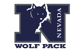
Look at Oregon, they did the big O and that was a game changer, look at Illinois and Nevada. Are you following what I am putting down ?
.
Illinois
Nevada
Louisiana Fan
Ragin' Cajuns #1 Fan
Script Cajuns or just the Fluer de Lis.
Stop with the silliness of the state. Our damn jerseys say Louisiana across the chest. Thats all that needs to be done.
Louisiana Fan
Ragin' Cajuns Fan for Sure
It’s not enough! So Oregon, Duke, Illinois, MSU, OSU, Nevada, Maryland, Missouri, Nebraska, Tennessee, North Carolina, South Carolina etc. they are all wrong and we are right?
 Louisiana
Ragin' Cajuns Fan for Sure
Louisiana
Ragin' Cajuns Fan for Sure
Agreed.
.A single letter only makes sense AFTER you establish what game you are watching, they are much less effective in the wild.
 lsu delenda est
Ragin' Cajuns #1 Fan
lsu delenda est
Ragin' Cajuns #1 Fan
Script Cajuns, FDL or L.
I prefer the L because it matches what other "name of state schools" are doing with their helmet logos, but the other two logos are good too.
Wow
.
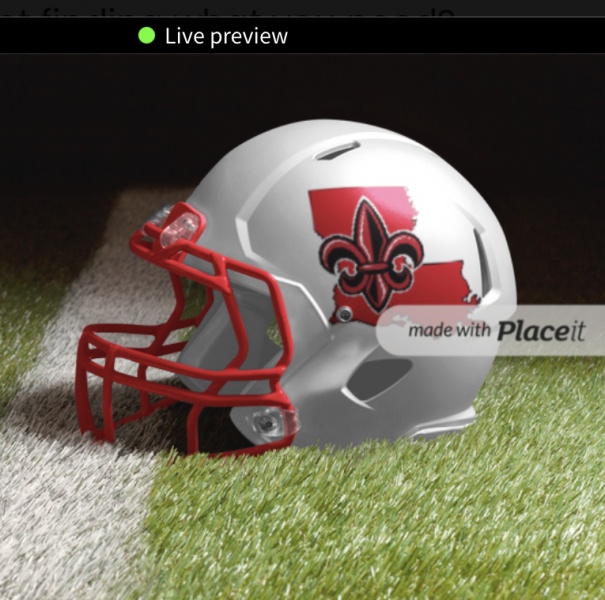
FDL with the state silhouette is slick, pleasantly appealing at any size and does exactly what it is designed to do . . . SCREAMS LOUISIANA . . . no other similar logo out there does for them what this does for us because the name of the other two is NOT Louisiana . . . com'n folks, get with the program while we still can . . . we need this for almost everything that we brand or where the brand is shown . . . thanks 9211 . . .
Louisiana Fan
Ragin' Cajuns Fan for Sure
Thanks
There are currently 1 users browsing this thread. (0 members and 1 guests)
 Posting Permissions

 Quote
Quote