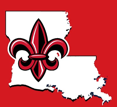
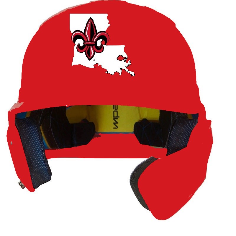
Due to overuse in the state but not actually saying anything I'm not a fan of the Fleur-de-lis in any way shape or form as a representative symbol.
But and however who am I to get in the way of 100 years of history.
Due to overuse in the state but not actually saying anything I'm not a fan of the Fleur-de-lis in any way shape or form as a representative symbol.
But and however who am I to get in the way of 100 years of history.
Oh I tried many L and the naysayers on this board are totally against it
. . . hit settings at the top . . . go to edit avatar . . . In middle you will see choose file . . . Choose from your pictures . . . then select one of these recent creations . . .
Another version! Thankyou

I think it looks good but we need to decide how to market and go forward with a symbol for Louisiana.

I came up with this L which is almost the same. I know people on this board have proposed using the L that is on the Louisiana font but it doesnt look good by itself. I tried to clean it up and make it stand alone.

There are currently 1 users browsing this thread. (0 members and 1 guests)