

. . . if we are going to adopt the L, it should be in the shape or silhouette of the State of Louisiana . . . that way when you see it, it SCREAMS LOUISIANA . . .

 Wow
.
Wow
.
. . . if we are going to adopt the L, it should be in the shape or silhouette of the State of Louisiana . . . that way when you see it, it SCREAMS LOUISIANA . . .
.
Yeah, that is more like Augie Tammariello's effort to change the school colors.Originally Posted by Swamp

Shadow and light can change the hue though.
True Vermilion is "aBlaze" per the very first newspaper article about Louisiana's first football game in 1901.
Boiled Crawfish are the right color.
 Louisiana Fan
Ragin' Cajuns Fan for Sure
Louisiana Fan
Ragin' Cajuns Fan for Sure
I was baseing these off the old USL logos with Ragin Cajuns in the middle .
.The L needs more flare.
A Louisiana silhouette would work.
Louisiana Fan
Ragin' Cajuns Fan for Sure
Yeah I like the Louisiana silhouette trying to incorporate the script Ragin Cajuns in it is the hard part. Kinda don’t have to with the FDL.
 Truly Blessed
.
Truly Blessed
.
Glad to see this. Thought my old eyes were playing tricks.
 NCSWIC.
Ragin' Cajuns Fan for Sure
NCSWIC.
Ragin' Cajuns Fan for Sure
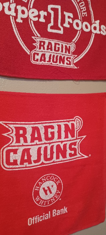
I hear what you're saying. But I have two of those rags they give out when there's big threat of rain at kickoff. Given Athletics attention to detail in this area, we can eliminate the idea that the vendor just randomly picked a red color.
NCSWIC.
Ragin' Cajuns Fan for Sure
I've definitely noticed it too
.
Hancock is Vermilion
 Ragin Cajuns
Ragin' Cajuns #1 Fan
Ragin Cajuns
Ragin' Cajuns #1 Fan
Check out this logo I created years ago and had on my car. It doesn't contain the script Ragin Cajuns but has the Louisiana silhouette with the black FDL where Lafayette is located. It's a start.
There are currently 1 users browsing this thread. (0 members and 1 guests)
 Posting Permissions

 Quote
Quote