I liked the different color award fleurdelis... does anybody have a copy of what the criteria were, (or is now) especially the academic ones...
Award stickers look good on softball helmets too (sometimes)
I liked the different color award fleurdelis... does anybody have a copy of what the criteria were, (or is now) especially the academic ones...
Award stickers look good on softball helmets too (sometimes)
It wasn't that long ago that we topped numerous lists winning g best uniforms, best logo, best nickname, etc. As ragin cajuns, What changed? Or is change the name of the game?
There it is. Now that's some Louisiana rep'n.
Extremely clean. I'll go so far as to say, time to leave the block stack and let's bring back what we should have never let go. I get it though, with the name change, the U wanted a new identity and came up with the fire and pepper and hot wheels, but it's time to listen to us alum, the citizens, the fans.
The Cajuns script is sick. Don't know what u got till it's gone.
LFG
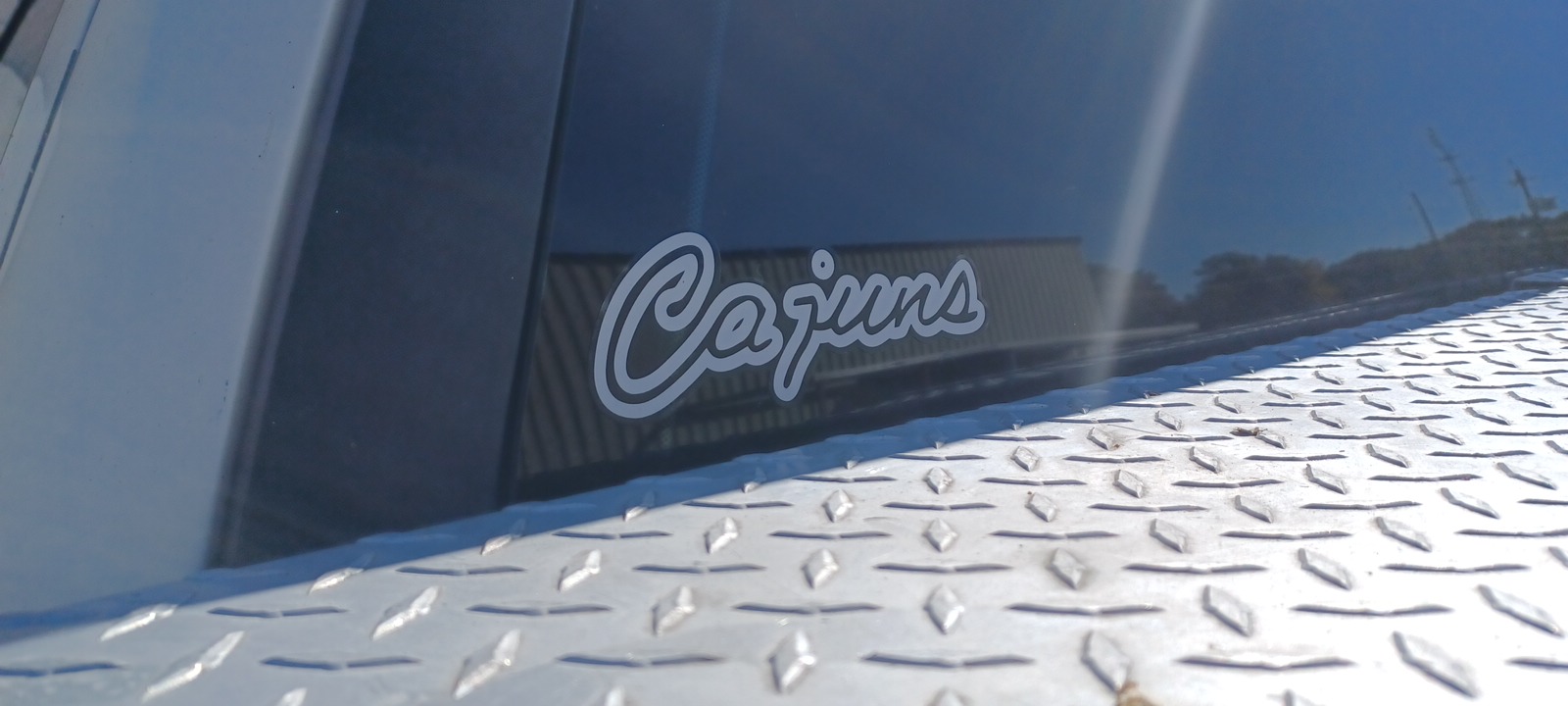
The stack needs to go. Its done its duty.
Script Cajuns and the FDL. That's all we need.
"Ragin" is the adjective. "Cajuns" is the noun. It's not hard. TSAB is the "Fighting Tigers", but you never see the word "Fighting" on anything, right?
Remember when State introduced that cartoon Tiger in the early 2000's. Didn't take them long to realize that thing blew and changed back to what was, tried, true and had a long time relationship with those which financially supported their programs. By the way, FLSU.
Our script means much more than a cool, old school emblem, much more. There are vested interests keeping the stack logo primary.
We can prove and end the debate forever this Louisiana Saturday Night. Place two polos, two columbia, two of those light weight long sleeve shirts inside the entry way at all 4 corners of the Swamp. When the paying fans scan their ticket or digital ticket, ask said paying customer which shirt he/she prefers. One shirt with the block stacked insignia or the script insignia.
While I agree that the script Cajuns and FDL is so much better, the stacked Ragin Cajuns logo is one of the most recognizable logos in the country. It doesn’t matter where I go. Florida, east coast, NY, California, Vegas wherever….when someone sees me with a stacked Ragin Cajun logo on the shirt they immediately know who I’m repping. So while I hate the crappy font and the flaming logo itself, I understand why the university has adopted it as it’s number one branding logo.
I just saw the bookstore now has a Cajuns Vintage collection with a few nice looking shirts.
https://louisiana.spirit.bncollege.com/c-14251
There are currently 1 users browsing this thread. (0 members and 1 guests)