Page 8 of 11 FirstFirst ... 5 6 7 8 9 10 11 LastLast
Results 106 to 120 of 154

Thread: Helmets

  1. Default Re: Helmets

    Quote Originally Posted by fanof71 View Post
    So, would Univ of Kentucky use KY on their helmets?

    Illinois use ILL?

    Alabama use ALA?

    While I agree our logo IDs have grown somewhat stale, I think LA is a step in the wrong direction. The stand alone L (got to choose a correct font) has a better chance.
    Only if it was jelly night

  2. #107

    Default Re: Helmets

    Quote Originally Posted by CajunEXPRESS View Post
    The flames don’t bother me at all. Unfortunately it’s part of the font UL has. I suppose we could just drop the flames altogether on the LA if that’s the only objection.
    The objection is LA. No one is going use LA in place of UL.

    We've been calling UL, UL since '99.

    There is no need for a LA in front of the State of LA.

    There is no need for an L, the State of Louisiana is the L.

    The fire letters and their directions, whatever, sure lets send them the same direction. Great.

    The fire letters have actually made an ok brand with us because of the very unique they've given our numbers. Minnesota Vikings look to have copied our numbers.

    The "Louisiana" written out, is an attempt to look like the fire letters. I found its' font years ago. That means even the written word brand "Louisiana" is an attempt to look like the fire letters.

  3. Default Re: Helmets

    Normally a font coordinates all numbers, and letters


  4. Default Re: Helmets

    Quote Originally Posted by Swamp View Post
    The objection is LA. No one is going use LA in place of UL.

    We've been calling UL, UL since '99.

    There is no need for a LA in front of the State of LA.

    There is no need for an L, the State of Louisiana is the L.

    The fire letters and their directions, whatever, sure lets send them the same direction. Great.

    The fire letters have actually made an ok brand with us because of the very unique they've given our numbers. Minnesota Vikings look to have copied our numbers.

    The "Louisiana" written out, is an attempt to look like the fire letters. I found its' font years ago. That means even the written word brand "Louisiana" is an attempt to look like the fire letters.
    The post I was addressing said his objection was that the flames were going in different directions. Additionally UL cannot be used by the university without the smaller Lafayette.

    My personal preferences are the FDL or the state without any letters. Longhorns, and Tiger Paw stand alone. The FDL absolutely can stand alone. Nobody is confused about the state or city, or Saints. Many people have no clue to where Austin is in Texas, and a great many don’t even know that the longhorns are in Austin. Constantly using the FDL with the oral Louisiana is all we need, unless some prefer being a regional university. If that’s important just UL Lafayette does that.

  5. #110

    Default Re: Helmets

    Quote Originally Posted by CajunEXPRESS View Post
    The post I was addressing said his objection was that the flames were going in different directions. Additionally UL cannot be used by the university without the smaller Lafayette.

    My personal preferences are the FDL or the state without any letters. Longhorns, and Tiger Paw stand alone. The FDL absolutely can stand alone. Nobody is confused about the state or city, or Saints. Many people have no clue to where Austin is in Texas, and a great many don’t even know that the longhorns are in Austin. Constantly using the FDL with the oral Louisiana is all we need, unless some prefer being a regional university. If that’s important just UL Lafayette does that.
    Not a person in Acadiana wants to be called UL Lafayette nor a regional university, might as well have named us University of Louisiana at Acadiana. I bet that would have an affect on that p.o.s. lsu rule with the two cities @ designation. Anyhow, I'm on the verge of saying lets just rid everything of the fire letters. They have caused constant issues since their inception. What many don't realize and it took me years to figure out is the ridiculous, lazy use of the black behind the letters themselves. Its a blob with no distinction behind the letters when the ridiculous outer border is removed. Everybody uses a background the same color of the outer border to eliminate the outer border. That makes an improvement, but even deeper into the issue is the black which does not make the directional changes in accord with the letters, instead there is a black background that curves in and out when its eazy. This was revealed in the 2017 helmet with simply the fire letters and no 400 layers behind them. Thats College Football: Symmetry is Simplicity. Two colors is Bold and to the point, no b.s.

    Yea, so lets get them flowing in the same direction. Next lets get that black (which becomes the red blob) layer from behind the letters, gone. This is extremely visible on the black helmet with the arched logo with the black changed to red.

    In no way whatsoever am I saying lets stop doing all this cool stuff with the helmets, the Fleurs (helmet stickers), state silhouette for warning, 337, the two bars, the arch, its all perfect except for the black background behind the fire letters. And of course the ridiculous outer border and lets get it all flowing in the same direction.

    Looking forward to Cold $2 Natty and a $20 GITM.

    Its Geaux time.

    Name:  new cajun.png
Views: 1076
Size:  947.9 KB

  6. #111

    Default Re: Helmets

    Good ideas from you guys, but in reality it is a waste of time. The university isn't going to change anything or listen to anyone on this site. They still never said anything about the mascot.


  7. #112

    Default Re: Helmets

    Quote Originally Posted by JMV JustMyView View Post
    Good ideas from you guys, but in reality it is a waste of time. The university isn't going to change anything or listen to anyone on this site. They still never said anything about the mascot.
    Its all good. I'm ready for some wide open Football in the Swamp.

  8. #113

    Default Re: Helmets

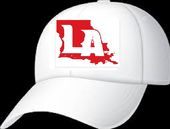
    Okay I put the flames the same way and did a little editing. I really wish we would go to the LA with the state no matter how much yall disagree! That logo is clean!
    Name:  1rc4 - Copy (2).jpg
Views: 838
Size:  34.9 KB
    Name:  1rc4.jpg
Views: 863
Size:  36.3 KB
    Name:  21-215936_red-football-helmet-png.png
Views: 815
Size:  143.4 KB
    Name:  201339472.jpg
Views: 837
Size:  52.4 KB
    Name:  1000_F_119391836_gQI9GGIasus4VWAXTPoty0AUYFcrCm5j.jpg
Views: 854
Size:  55.1 KB
    Name:  images.jpg
Views: 843
Size:  31.7 KB
    Name:  images (5).jpg
Views: 859
Size:  38.5 KB


  9. Default Re: Helmets

    Quote Originally Posted by Ragin9221 View Post
    Okay I put the flames the same way and did a little editing. I really wish we would go to the LA with the state no matter how much yall disagree! That logo is clean!
    Name:  1rc4 - Copy (2).jpg
Views: 838
Size:  34.9 KB
    Name:  1rc4.jpg
Views: 863
Size:  36.3 KB
    Name:  21-215936_red-football-helmet-png.png
Views: 815
Size:  143.4 KB
    Name:  201339472.jpg
Views: 837
Size:  52.4 KB
    Name:  1000_F_119391836_gQI9GGIasus4VWAXTPoty0AUYFcrCm5j.jpg
Views: 854
Size:  55.1 KB
    Name:  images.jpg
Views: 843
Size:  31.7 KB
    Name:  images (5).jpg
Views: 859
Size:  38.5 KB
    Damn if I’m not getting on this boat.

  10. Default Re: Helmets

    Quote Originally Posted by Ragin9221 View Post
    Okay I put the flames the same way and did a little editing. I really wish we would go to the LA with the state no matter how much yall disagree! That logo is clean!
    Name:  1rc4 - Copy (2).jpg
Views: 838
Size:  34.9 KB
    Name:  1rc4.jpg
Views: 863
Size:  36.3 KB
    Name:  21-215936_red-football-helmet-png.png
Views: 815
Size:  143.4 KB
    Name:  201339472.jpg
Views: 837
Size:  52.4 KB
    Name:  1000_F_119391836_gQI9GGIasus4VWAXTPoty0AUYFcrCm5j.jpg
Views: 854
Size:  55.1 KB
    Name:  images.jpg
Views: 843
Size:  31.7 KB
    Name:  images (5).jpg
Views: 859
Size:  38.5 KB
    Gross take the “A” out

  11. #116

    Default Re: Helmets

    tho' it tries to avert the effect by putting the little gap inside the "a," the logo ends up looking like it has deformed the state. it's hard to look at for me.


  12. Default Re: Helmets

    I like the first one for a sign or a brochure or something but it seems way too big for a hat and a little big for a helmet


  13. Default Re: Helmets

    Quote Originally Posted by Sonsissymia View Post
    tho' it tries to avert the effect by putting the little gap inside the "a," the logo ends up looking like it has deformed the state. it's hard to look at for me.
    If that is all the state has to worry about we are in good shape

  14. #119

    Default Re: Helmets

    I have no problem with the state, but we are UL and should not move away from it.


  15. Default Re: Helmets

    Tell that to T Joe


Page 8 of 11 FirstFirst ... 5 6 7 8 9 10 11 LastLast

Thread Information

Users Browsing this Thread

There are currently 2 users browsing this thread. (0 members and 2 guests)

Posting Permissions

  • You may not post new threads
  • You may not post replies
  • You may not post attachments
  • You may not edit your posts
  •