

Terrible.Originally Posted by Ragin9221


 Geaux Louisiana!
Ragin' Cajuns #1 Fan
Geaux Louisiana!
Ragin' Cajuns #1 Fan
Terrible.
 NCSWIC.
Ragin' Cajuns Fan for Sure
NCSWIC.
Ragin' Cajuns Fan for Sure
I only wish that was on my wall! That wall is on Reinhardt.
Big Buds
Ragin' Cajuns #1 Fan
We must follow suit.
N - Nebraska
N - Nevada
A - Alabama
A - Arkansas
A - Arizona
F - Florida
M - Michigan
M - Minnesota
T - Texas
T - Tennessee
W - Wisconsin
 Louisiana Fan
Ragin' Cajuns Fan for Sure
Louisiana Fan
Ragin' Cajuns Fan for Sure
Like I said I have messed with it more then what I should. I have messed with all different types of fonts and different colors. the slim one is the best I could come up with. Like I said you think you want a block L but its not an A, T, M, W, G, O whatever. those are very symmetrical letters and very pleasing to the eye, L is just not.
Why a FDL, or a Star looks great.
Louisiana Fan
Ragin' Cajuns Fan for Sure
All have symmetry
Louisiana Fan
Ragin' Cajuns Fan for Sure
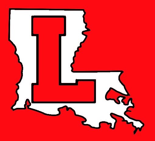
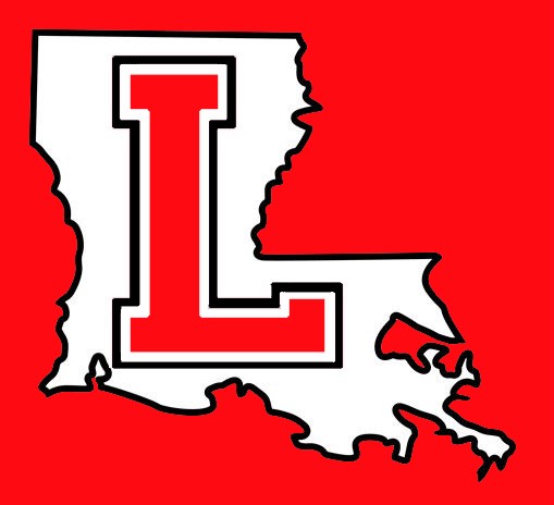
Dont think I forgot about you. These look pretty sharp. I am down. I made it simple block L to make it more symmetrical.
Louisiana Fan
Ragin' Cajuns Fan for Sure
I think I like these better. DAMN that looks sharp! Way better with the double border!
Does it say Louisiana-Lafayetttte though? To me it SCREAMS Louisiana.
Louisiana Fan
Geaux Cajuns
Too much like la turd
Louisiana Fan
Ragin' Cajuns Fan for Sure
Cant Please them all. Does look good on a hat though. It does look legit.

Louisiana Fan
Geaux Cajuns
If you just take the state outline and put the FDL where Lafayette is then you gots a winner
There are currently 1 users browsing this thread. (0 members and 1 guests)
 Posting Permissions

 Quote
Quote