

Am I the only one thinking this is way to similar to tech??Originally Posted by Turbine


 Louisiana Fan
Ragin' Cajuns #1 Fan
Louisiana Fan
Ragin' Cajuns #1 Fan
Am I the only one thinking this is way to similar to tech??
.
It's an early prototype.
Tech's T breaks out of Louisiana as if they are claiming lower Arkansas.
My idea is to embed Louisiana's FDL in the corner of the L where Acadiana is.
This will enable Louisiana to license the design for branding and commercial purposes.
 lsu delenda est
Ragin' Cajuns #1 Fan
lsu delenda est
Ragin' Cajuns #1 Fan
Anybody remember this one?

 Louisiana Fan
Ragin' Cajuns Fan for Sure
Louisiana Fan
Ragin' Cajuns Fan for Sure
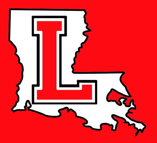
Lol! Well let’s see! Our letter is red, there’s are red, we have a double border, they have a single, the outline of the state is white, ours is black, and our letter is in the middle, and there’s is on top. I still think this one looks better then Tech!
Louisiana Fan
Geaux Cajuns
Tech’s Louisiana look kinda downsy
Louisiana Fan
Ragin' Cajuns Fan for Sure
If you notice they represent Southern Arkansas we represent Louisiana!! The logo says it all
Louisiana Fan
Geaux Cajuns
Something to consider, which I'm *guessing* is part of the rationale of Tech's "smoothed" Louisiana state outline. I can imagine it would be difficult and expensive to print an outline of the state that includes all of the detail around the delta, especially on ball caps.
Louisiana Fan
.
The T standing for Tech is awful and ridiculously big.
 Ragin Cajuns
Ragin' Cajuns #1 Fan
Ragin Cajuns
Ragin' Cajuns #1 Fan
Here is a logo I designed a few years ago and had made into a car sticker.
I don't know how to separate the letters. But, take the U out of it and the L with FDL where the university is located with the state looks really good. Including Ragin Cajuns with it incorporates all of our branding initiatives.
Big Buds
Ragin' Cajuns #1 Fan
This is fire! The L need to be positioned on the lefthand/west side of the state! Make this happen! Lol
There are currently 1 users browsing this thread. (0 members and 1 guests)
 Posting Permissions

 Quote
Quote