In time the benefit of R-1 status will influence perception, providing academics quits living on pins and needles over at Lafayette. They live in a Newspeak world.
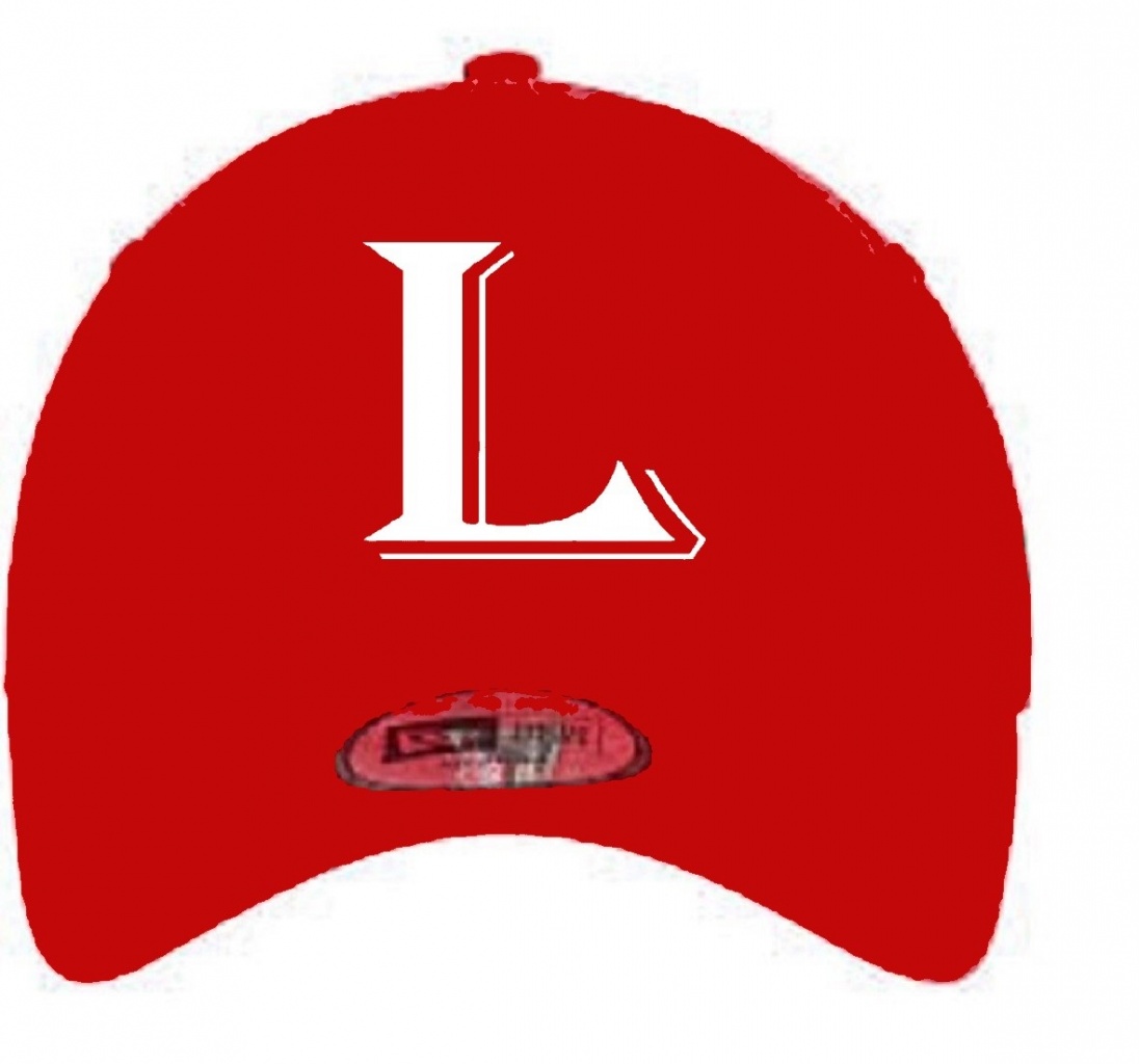
I came up with this L and I think it fits with the current L font that we currently use, now it is not professional. If you clean it up I think it would look great. Here it is trust me I have looked at alot of logos and alot of L's and I think this one fits the best. It can interchange from red to white, either way. Think of this like a secondary logo. Like the A for Arkansas, or F for Florida, or A for Arizona. Or the O for Oregon

Love it.
Can you try one where the thin vertical shadow line maintains the same gap (and doesn't touch) at the base?
Just a thought.
Like this? Honestly this looks better. Good call.
Attachment 17417
This will totally give my fanaticism away. I use to create logos for NCAA football the game and thought if Louisiana was a LSU, or Alabama what would that look like so I create these logos.
I love our logo’s but we need something else to have a big time P-5 feel. So I always try to create something that had that look.
I love the Ragin Cajun logo but feels small time, I like the FDL better, but we need to step it up, and a lot people don’t like it because it is copying the Saints. We need to dictate who we are I think something like that would be a step in the right direction.
Trust me I have looked and mess with it countless hours.
Total Nerd!!! I know
I use 3D paint so it is not a real hat. All I did was match the color with that logo. That L probably could be thicker, but seriously that hat looks just as good as Florida, Arkansas, Texas, Clemson etc. do I need to go on? Don’t reinvent the wheel, stick to what works! Keep it simple.

My question is if cbs is abbreviating names on the ticker why not just use LA? Lol
LA looks to much like Los Angeles to me, L’siana, I mean I can look at that and say that’s Louisiana.
Try to think how else would you abbreviate it and automatically know that’s Louisiana?
There is no other way except for LA, or L’ana, Louana, L’iana, Losiana, Louis(Louisville). I mean nothing else works
There are currently 1 users browsing this thread. (0 members and 1 guests)