Its even worse than that. (This might have been discussed somewhere else in the last two years, lol)
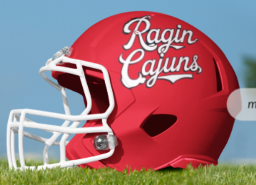
The stacked Ragin' Cajuns is opposite in direction because it takes the text directions from the hot wheels logo (Ragin' Cajuns only) and just smushes it down. Thus the opposite text directions, because they are moving clockwise around the circle.
However, if you look at the "Louisiana Ragin' Cajuns" version of the hot wheels logo, the letters in Ragin' Cajuns all point the same way because they are all at the bottom.
I voted yes to the script but like the stacked when its only white on red or red on white like it is on the helmet.
Ive seen the stacked logo with the yellow on the pepper and black red and white all being used. Its too busy that way.
I did this one?

There are currently 1 users browsing this thread. (0 members and 1 guests)